New Banner October 2008!
Short note: this is a scheduled post. Nicole is down with fever.
The previous banner as everyone would know, was not exactly a clear one.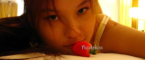
Though I love the banner, it was time to move on to a better banner! *point up* :D
What do you think? Is it ok? Not bad? Not too shabby? Pretty bad?
I have come out with a few designs before settling for the current one. My photoshop skill isn't as good so there is a limit to what I can do *shrug*. But I am still learning. :)
Initially it was without background, but decided it didn't match my blog theme, hence I chose a random background to match it with.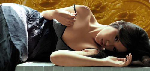
The current using banner was my second product. It's a self-drawn background, random brushing with several colors.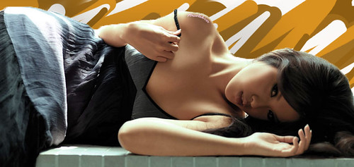
Then I figure why not de-saturate myself, in contrast with the background.
Or maybe with a more prominent background. Build up more contrast.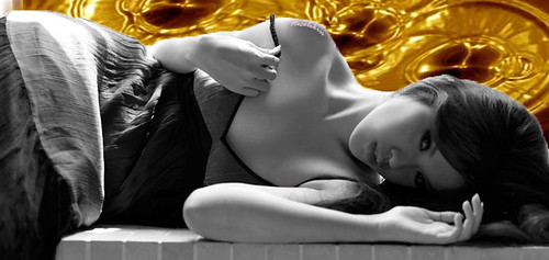
After that I got lazy. So yep, that's about it.
I thought it was pretty good though I have to admit it's not the best. SOOO... here something for you guys to do!
Take this original cut out photo, and see if you can produce a better banner than me.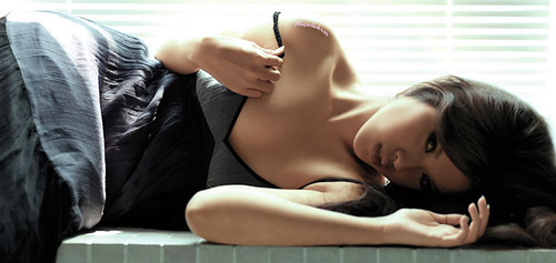
Click for 840 pix size.
Who knows. If it's really good and I really like it, I might use it as my new banner and plug your site (if you want).
You can send the product to nicootan@gmail.com


13 kissed Nicole
Why not black and white more sensual and sophiscated.
ReplyDeletewhy not black and white gray surrounding. More sensual and sophiscated.
ReplyDeleteMight give it a try when I can find the time. It's a nice photo.
ReplyDeleteAll are great. Just change it every week with a different one. We would luv to feel u differently.
ReplyDeletewooo nice i like ...
ReplyDeletefwah just see the banner can nose bleed
so, u suck at photoshop?
ReplyDeletehttp://www.youtube.com/watch?v=U_X5uR7VC4M
haha, not meant to offend, is juz the series name.
The new banner looks sassy :)
ReplyDeleteDown with fever? Hope you will recover soon!
ReplyDeleteDid they photoshop your chest? It looks very unnatural and flat
ReplyDeleteRather prefer your previous banner cos the lastest one looks a piece of dead log.
ReplyDeleteI definitely prefer the old header. It has a more down to earth feel, natural and simple.
ReplyDeleteSimple being the key word here, I think simplicity is the best way to go about.
As for the header that u are using right now. The skin, especially at the shoulders look very fake, something looks wrong with the tone and texture of it. But i do like the paint brush background tat u have done, among the other backgrounds, it is the best option.
The original picture is already good. The background is simple and brilliant enough. Because with that plain background, u create a focal point towards your face and body.
with distracting backgrounds, u create too many focal point that really destroys the design. Simplicity is authentic!
wonder if you got the banner design that i sent to your gmail.
ReplyDeletecheers
your previous strawberry banner was superb. the current one can't match it no matter how much photoshopping you do.
ReplyDelete